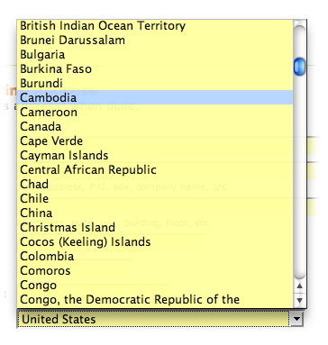
Since moving back to Canada, I have a major problem with the country drop-down list just about every web site on the planet seems to use: an alphabetically ordered list of countries. You’re cruising along, trying to enter information as fast as possible, and you run straight in Cambodia.
Yes. Cambodia. Nothing says “screw you Canada!” like a drop-down list that defaults to Cambodia as the first entry for the letter ‘C’.
While most Internet developers seem to have developed just enough intelligence to code an HTML SELECT drop-down and put the “United States” at the top of the list, they haven’t quite figured out that the same technique might be useful for other countries. So here you go guys, here’s my free user experience advice to you: order the damn list by Internet usage.
It makes sense, doesn’t it? Show the list in the order that most represents the real state of the online world. The world isn’t alphabetical. You cannot try to tell me the next most important country after the United States is Afganistan – they’re a little more concerned with running water and electricity these days to be buying a Kindle from Amazon.com.
If you do that, here’s what it would look like:
Now, I admit, Canada still ends up being below China, but that’s a bit less insulting frankly. Nothing wrong with coming after a country with a fifth of the world’s population. But if you’re really tricky, you might even order the list based on your target audience – I mean, are you really selling to China from your North American web site? Probably not. Or what about ordering the list according to Internet spending by country?
Some dropdowns are dynamic and query to determine most probable country before writing the HTML. I personally would prefer alphabetic instead of searching on your proposed scheme; the former is more consistent even though one may have political issues with Cambodia and Cameroon… This is partly also because you could inadvertently annoy the “long tail” countries — at least alphabetical is fair.
There are other tricks you can do like ensure the dropdown always displays results going down and the dropdown menu is large enough so as to avoid scrolling, that is, display at minimum all the countries starting with a certain letter. Possibly allow multil character selection so if one typed “can” it would go to “Canada” instead of “Cambodia”. That, or get Google to autofill dropdowns (or maybe they do this already).
PeterApril 1, 2008
This is not a good idea – too confusing.
Just better to use either the browser’s language setting, or IP geolocation.
Alright, so it sounds like it’s just me that uses the keyboard to navigate drop-down lists. I usually just hit the first letter of what I want – but it sounds like people are more likely to arrow through/click through the selection options than to use the keyboard shortcuts. If that’s the case, then yes, my proposal would be very confusing indeed.
Actually, I like Jesse’s idea of multi-character auto-selection – that would work nicely. You still get a drop-down for the novice user, but add a bit of intelligent behaviour to make it faster for the expert user. Good option.
While I agree with Peter that avoiding the need to even fill out the country in the first place would be great (go-go Gadget OpenID Simple Registration Extension!), auto-selecting the country based on IP geolocation or browser language settings, those aren’t always accurate indicators of location.
peacekeeperApril 2, 2008
You find it “insulting” that your precious Canada is not the first entry under C?
You think statistics people never heard about are more intuitive than alphabetical order?
Countries you know nothing about should be ranked after yours because they are less “important”?
Using 5 seconds of your life to hit C three times instead of once is a “major problem” for you?
What I think is that a purely alphabetical ordering makes absolutely no sense when half the countries on the list have little or no Internet access, represent a trivially small percentage of the traffic on the Internet, or are highly unlikely to be purchasing goods from these web sites.
Agreed it’s not the best way, but the group already identified a half dozen others. Ideally, you’d use something like OpenID to handle authentication, and you’d never have to deal with entering this detail on a web site ever again.
And yes, I do spend too much time online. 😉
Simple GuyJune 30, 2008
I stumbled upon this article when I was hunting for a list of countries to populate for the “Country Dropdown List” for my new new website. The target audience is USA & Canada and if I stretch it a bit, the Western European countries and some of the more Internet savvy countries.
I have decided to take a stand and *not* be politically correct by listing each and every country where as my website is not even intended for users from those countries.
I am going to prune the list down to not include countries that are not the target audience for the moment.
Turns out I’m not crazy – if you look at Google Analytics’ sign-up process, their drop down has the following countries at the top of the list (in this order): United States, Australia, Austria, Belgium, Brazil, Canada, China, Denmark, Finland, France, Germany, Hong Kong, Italy, Japan. It then continues in similar fashion, listing only the one or two biggest markets for the company in alphabetical order, before listing the remaining countries in purely alphabetical order.
It’s a nice compromise, and solves the problem nicely.
Ken WelsbyAugust 13, 2008
Just caught up with this, chaps because I’m specifying it for our new e-biz.s platform. We’re starting the list with the 10 most frequent customer origins, which are the same for both travel trade customers and independent web visits – according to our analytics – and then going into the full alphabetical list. Living in the United Kingdom – which has millions of web users and e-commerce customers – I am always irritated by companies who make me roll through dozens of countries which combined have less spending power than we do.
CyberTSeptember 8, 2008
Your list makes the assumption that the user knows that they may use a keyboard shortcut to jump to positions in the list. Other wise, it just looks unordered and confusing. Sorry, this is bad UI as its targeted at an already technically adept audience. An alphabetical list whislt mildly annoying for the g33ks and their shortcuts is accessibly to everyone.
@CyberT: Agreed, on reflection the original approach is anti-user; however, I like the approach that Google Analytics takes (see above) – it’s a bit of a hybrid. It’s still alphabetical, but it takes into account the markets their product is serving – a better solution than a purely alphabetical list, which is also anti-user (in my opinion).
What is wrong with people typing in their country, just as they type in their town, or street address.
Can someone please explain what I cannot see?
I’ve just had a customer saying that she didn’t know what to type for her country (United Kingdom) in an address form I did, because it was not a drop down list, but a free-form text entry? Is this the reason: because people are used to dropdowns and cannot handle anything different?
I think the main reason is really consistency – the application may need to make decisions based on country (and possibly state, province, or region) and thus needs to be able to reliably determine which country the user is in. If the form is free-form, then there’s an additional dimension of freedom for the user that results in major overhead for the programmer.
For example, let’s say you need to determine shipping charges, and hence need to know if something is a domestic or international destination. If the country entry is free-form text, your application will need to know that “United Kingdom”, “UK”, “U.K.”, “Untied Kindom” are all mean to be interpreted as “United Kingdom”.
A drop-down avoids this uncertainty, and also eliminates user frustration (“I’m sorry Dave, I can’t ship to ‘Untied Kindom'”).
Very confused list. Users will be in lost and have to waste some time to understand how the list is arranged. So, actually it is not doing any good.
RedEldoradoMay 10, 2009
Your article is food-for-thought. Aspects of it do have merit, especially the Cambodia before Canada situation. I decided to list the following countries first, (United States, Australia, Austria, Belgium, Brazil, Canada, China, Denmark, Finland, France, Germany, Hong Kong, Italy, Japan, Mexico, Netherlands, Spain, United Kingdom), followed by (most of) the entire list of countries listed alphabetically. I believe most of my customers will be from the United States, thus my decision to place U.S. first. Thanks.
Some dropdowns are dynamic and query to determine most probable country before writing the HTML. I personally would prefer alphabetic instead of searching on your proposed scheme; the former is more consistent even though one may have political issues with Cambodia and Cameroon… This is partly also because you could inadvertently annoy the “long tail” countries — at least alphabetical is fair.
There are other tricks you can do like ensure the dropdown always displays results going down and the dropdown menu is large enough so as to avoid scrolling, that is, display at minimum all the countries starting with a certain letter. Possibly allow multil character selection so if one typed “can” it would go to “Canada” instead of “Cambodia”. That, or get Google to autofill dropdowns (or maybe they do this already).
This is not a good idea – too confusing.
Just better to use either the browser’s language setting, or IP geolocation.
Alright, so it sounds like it’s just me that uses the keyboard to navigate drop-down lists. I usually just hit the first letter of what I want – but it sounds like people are more likely to arrow through/click through the selection options than to use the keyboard shortcuts. If that’s the case, then yes, my proposal would be very confusing indeed.
Actually, I like Jesse’s idea of multi-character auto-selection – that would work nicely. You still get a drop-down for the novice user, but add a bit of intelligent behaviour to make it faster for the expert user. Good option.
While I agree with Peter that avoiding the need to even fill out the country in the first place would be great (go-go Gadget OpenID Simple Registration Extension!), auto-selecting the country based on IP geolocation or browser language settings, those aren’t always accurate indicators of location.
You find it “insulting” that your precious Canada is not the first entry under C?
You think statistics people never heard about are more intuitive than alphabetical order?
Countries you know nothing about should be ranked after yours because they are less “important”?
Using 5 seconds of your life to hit C three times instead of once is a “major problem” for you?
You spend too much time online.
What I think is that a purely alphabetical ordering makes absolutely no sense when half the countries on the list have little or no Internet access, represent a trivially small percentage of the traffic on the Internet, or are highly unlikely to be purchasing goods from these web sites.
Agreed it’s not the best way, but the group already identified a half dozen others. Ideally, you’d use something like OpenID to handle authentication, and you’d never have to deal with entering this detail on a web site ever again.
And yes, I do spend too much time online. 😉
I stumbled upon this article when I was hunting for a list of countries to populate for the “Country Dropdown List” for my new new website. The target audience is USA & Canada and if I stretch it a bit, the Western European countries and some of the more Internet savvy countries.
I have decided to take a stand and *not* be politically correct by listing each and every country where as my website is not even intended for users from those countries.
I am going to prune the list down to not include countries that are not the target audience for the moment.
Turns out I’m not crazy – if you look at Google Analytics’ sign-up process, their drop down has the following countries at the top of the list (in this order): United States, Australia, Austria, Belgium, Brazil, Canada, China, Denmark, Finland, France, Germany, Hong Kong, Italy, Japan. It then continues in similar fashion, listing only the one or two biggest markets for the company in alphabetical order, before listing the remaining countries in purely alphabetical order.
It’s a nice compromise, and solves the problem nicely.
Just caught up with this, chaps because I’m specifying it for our new e-biz.s platform. We’re starting the list with the 10 most frequent customer origins, which are the same for both travel trade customers and independent web visits – according to our analytics – and then going into the full alphabetical list. Living in the United Kingdom – which has millions of web users and e-commerce customers – I am always irritated by companies who make me roll through dozens of countries which combined have less spending power than we do.
Your list makes the assumption that the user knows that they may use a keyboard shortcut to jump to positions in the list. Other wise, it just looks unordered and confusing. Sorry, this is bad UI as its targeted at an already technically adept audience. An alphabetical list whislt mildly annoying for the g33ks and their shortcuts is accessibly to everyone.
@CyberT: Agreed, on reflection the original approach is anti-user; however, I like the approach that Google Analytics takes (see above) – it’s a bit of a hybrid. It’s still alphabetical, but it takes into account the markets their product is serving – a better solution than a purely alphabetical list, which is also anti-user (in my opinion).
Why do we even need a drop down for country?
What is wrong with people typing in their country, just as they type in their town, or street address.
Can someone please explain what I cannot see?
I’ve just had a customer saying that she didn’t know what to type for her country (United Kingdom) in an address form I did, because it was not a drop down list, but a free-form text entry? Is this the reason: because people are used to dropdowns and cannot handle anything different?
I think the main reason is really consistency – the application may need to make decisions based on country (and possibly state, province, or region) and thus needs to be able to reliably determine which country the user is in. If the form is free-form, then there’s an additional dimension of freedom for the user that results in major overhead for the programmer.
For example, let’s say you need to determine shipping charges, and hence need to know if something is a domestic or international destination. If the country entry is free-form text, your application will need to know that “United Kingdom”, “UK”, “U.K.”, “Untied Kindom” are all mean to be interpreted as “United Kingdom”.
A drop-down avoids this uncertainty, and also eliminates user frustration (“I’m sorry Dave, I can’t ship to ‘Untied Kindom'”).
Very confused list. Users will be in lost and have to waste some time to understand how the list is arranged. So, actually it is not doing any good.
Your article is food-for-thought. Aspects of it do have merit, especially the Cambodia before Canada situation. I decided to list the following countries first, (United States, Australia, Austria, Belgium, Brazil, Canada, China, Denmark, Finland, France, Germany, Hong Kong, Italy, Japan, Mexico, Netherlands, Spain, United Kingdom), followed by (most of) the entire list of countries listed alphabetically. I believe most of my customers will be from the United States, thus my decision to place U.S. first. Thanks.